
Branding•Creative
Sultan Brand Identity
A bilingual cleaning brand built around confidence, clarity and the power of clean.
Client
Sultan
Year
2025
Category
Branding
Division
Creative
Project Overview
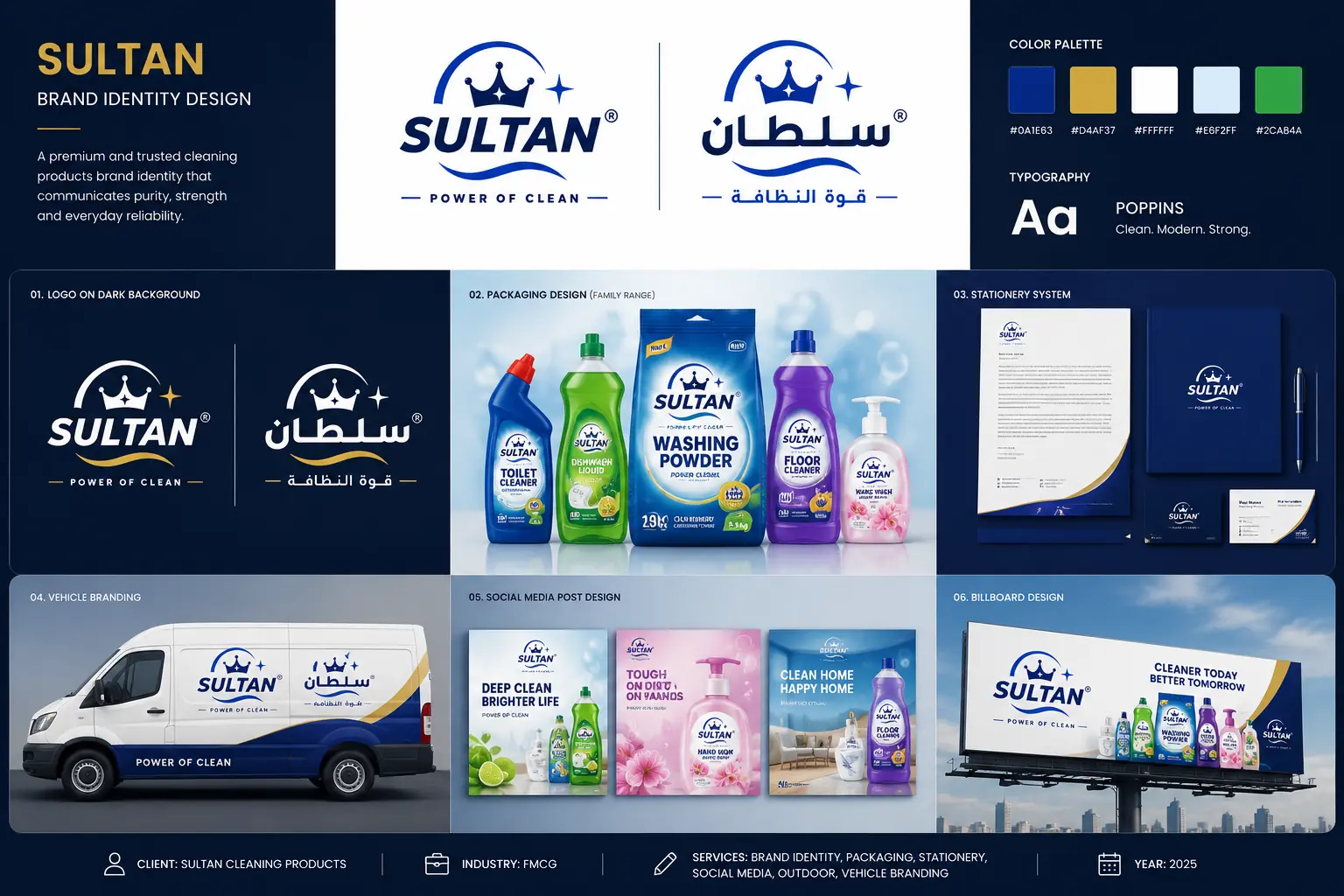
An identity direction for Sultan cleaning products, connecting English and Arabic logo systems with packaging, stationery, vehicle branding, social layouts and outdoor advertising. The presentation shows how one visual language can support a varied household cleaning range.
The Challenge
Create a recognizable identity that works in two languages and remains consistent across products with different shapes, sizes and uses.
The Approach
Build recognition around a shared crown-and-sparkle symbol, a strong blue wordmark and a flowing underline. Carry those elements into each application, using product colour cues within a consistent brand structure.
Creative Direction & Execution
Deep blue communicates a confident cleaning-brand presence, with gold accents adding warmth and distinction. English and Arabic signatures share the same visual cues, supported by Poppins typography and clear product hierarchy.
English and Arabic identity development, light and dark logo treatments, palette and typography definition, a cleaning-product packaging family, business stationery, bilingual van livery, social campaign layouts and a billboard concept.
Project Outcome
A connected English and Arabic identity system.
A coordinated visual direction across five cleaning-product formats.
Brand applications presented across print, transport, social and outdoor touchpoints.
Identity & Applications
English & Arabic logo system
Paired English and Arabic signatures share the crown, sparkle and flowing underline.
Colour & typography
A blue-led palette, gold accents and Poppins typography establish the core visual language.
Reversed logo applications
White and gold logo treatments retain contrast on a dark navy background.
Cleaning product family
A coordinated packaging direction across powder detergent, toilet cleaner, dishwashing liquid, floor cleaner and hand wash.
Business stationery
Letterhead, folder and business card mockups extend the identity into company communications.
Vehicle branding
A bilingual van livery pairs the brand signatures with sweeping blue and gold forms.
Social campaign direction
A family of product-led social layouts uses consistent branding and colour cues.
Outdoor advertising
The product range and bilingual identity come together in a billboard application.
Services Delivered
Brand IdentityBilingual BrandingPackaging DesignStationery DesignVehicle BrandingSocial Media DesignOutdoor Advertising
Next Case Study
Sif Brand Identity & Packaging