Branding•Creative
Kiztech Brand Identity
A construction identity shaped by precision, reliability and building excellence.
Client
Kiztech Builders & Contractors
Year
2026
Category
Branding
Division
Creative
Project Overview
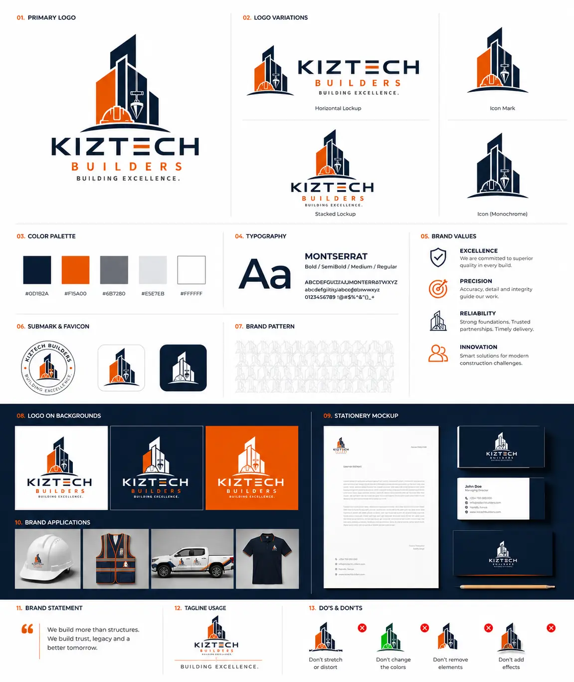
A visual identity system for Kiztech Builders & Contractors, from the core construction symbol and flexible logo lockups to stationery, workwear and vehicle applications. The brand board brings the foundations and everyday uses together in a practical identity framework.
The Challenge
Give a construction business a distinctive identity that feels technically credible and remains recognizable on office materials, digital icons and equipment used on site.
The Approach
Combine a building silhouette, hard hat and plumb bob into one recognizable symbol. Establish horizontal, stacked and icon versions, then support them with consistent colour, typography and application rules.
Creative Direction & Execution
Deep navy and safety orange create a confident construction palette. Geometric lettering and Montserrat typography reinforce a structured visual language, while monochrome marks and a subtle repeated pattern add flexibility.
Logo development and lockups, icon and monochrome treatments, colour and typography foundations, submark and favicon concepts, supporting pattern, stationery, hard hat and vest branding, pickup livery and a branded polo presentation.
Project Outcome
A flexible logo family with horizontal, stacked, icon and monochrome treatments.
Defined colour, typography and supporting graphic foundations.
A coordinated application direction for the office, team and construction site.
Identity & Applications
Primary identity
A building silhouette, hard hat and plumb bob connect the mark to construction and technical precision.
Flexible logo lockups
Horizontal and stacked versions adapt the identity to different formats.
Icon & monochrome mark
The symbol works independently and in a single-colour treatment.
Colour foundations
Deep navy and safety orange lead a practical palette supported by grey and white.
Typography
Montserrat provides a structured typographic family across several weights.
Submark & digital icons
A circular submark and compact icon treatments support smaller applications.
Supporting pattern
A repeated construction symbol creates a subtle supporting brand texture.
Logo on brand backgrounds
Light, navy and orange applications demonstrate contrast and logo flexibility.
Site & team applications
Hard hat, high-visibility vest, pickup and polo mockups bring the identity into the working environment.
Business stationery
Letterhead, business cards, a notebook and pencil form a coordinated stationery presentation.
Services Delivered
Brand IdentityLogo DesignBrand GuidelinesStationery DesignWorkwear BrandingVehicle BrandingDigital Branding
Next Case Study
Bloom Brand Identity